Sunday, 15 July 2012
state of mind: progress ii
Starting was extremely hard.... My sketch seemed like a brilliant idea for dysphoria because I thought of it as a dark cloud that always above you and bringing you down sort of thing, so... you know... yeah. But then I had no idea how I would do it on Photoshop. It was so hard! I was like..... Should I just trace everything and then put some colors behind the layer? It seemed too... simple and it would probably look like I didn't even do anything... But hey I thought about it so that should count! Heheh heheh. But yeah I ditched that idea...

For some (incredibly) stupid reason, I started tracing out a dragon.... and started coloring it in... And then I stopped because I had no idea why I was even doing it.
{insert facepalm here}

So then I was like........ hmmmm I need to do something I enjoy doing rather than force myself to make something pretty out of conventional pretty things... (bahahahahahahahhahahah). I like to create pretty things out of weird, unpretty things (to other people) because I'd like to think I see beauty in what people perceive as ugly or stuff people go "i don't see what the big deal about this is" hahah, like masking tape! I am absolutely bonkers about masking tape, and like, any kind of tape... and receipts.. I keep so many... and the reason isn't because I wanna calculate my expenses... but it's because I think receipts are very very pretty! And mail stamps... Ohhhh I love mail stamps.
SO ANYWAY... Ugh severe ADHD....... Um... I started sticking tapes and tearing out receipts from my hoarder-stash... And one sketch of an eye (and I have millions of eye drawings... even on tissue paper, DARNIT I should have used those)..

And I scribbled stuff with um... watercolour... wait, is it even proper english to say you scribble with watercolor? Whatever. But yeah I did.. And I used markers and color pencils, too. And as usual, I scanned wrinkly messy stuff for texture-purposes.
Here are the stuff I scanned:

{don't mind the stupid file names}
And so my outcome was....... that!

You probably won't like it, but maybe that's the whole point (hahaha).
It's supposed to represent dissatisfaction so I used the scribble. Because most negative emotions would be nicely represented by roughness and scribbles are rough, I think? It's in blue because when you're down you're feeling "blue" hahaha but not that kind of blue I guess, but it looks nice in that shade so I used that shade. And um, kitchen roll because the person is not satisfied with toilet role because they're too small and you have to pull so much to get the right amount, but with kitchen roll, you only have to tear out one piece. Haha shut up, it makes sense to me. And then um, the drawing over this person's own eye with rough marker scribbles represents the dissatisfaction she has with her eyes, hence the other eye is replaced with a drawing of an eye, which is the person's ideal eye(s). And then I took the dripping black watercolor thingy I made at the beginning and put it on top of her head and the long drip is dripping down her face because..... it looks dramatic that way. It's kind of like.... blood dripping down her face cos her negative thoughts about herself is kind of killing her brain, so her brain is dying from all the dissatisfaction she is experiencing. Masking tape represents temporariness, because when youre using masking tape, you want to stick something to something, and you know it does the job, and it can hold for a while, but you know it's not gonna stick forever
The receipt bit is my favorite part because it's a receipt of this one time I bought vitamins... I think it was primrose oil or something.. but it just said health supplement on the receipt, so yeah! Perfect. I think it's cool because when people are dissatisfied with their body or something they would just keep buying stuff to treat it/prevent it/get rid of it. [sidenote] Oh mann I should've done a freak who loves make-up because she's insecure and unsatisfied with herself. That would have been good. [/sidenote]
With euphoria, I got inspired by these

To be honest when I looked at it I did not see the horses.... I am only seeing them now... Wow. Hahahaha but anyway, I don't know why but I thought this would've been suitable for euphoria because it's like.... your hair when its underwater (if you have long hair that is) and it's just like so pretty... So I kinda imagined a sexy mermaid having umm.... sexytime and how her hair would be all dskghsdghdksd like so nice...

And I liked this because of it coming out of the circle, and with euphoria it would look good because it's almost like an explosion of happiness, therefore going out of the circle.
So I attempted that hair thing and guess what? I FAILED. Hahahahah. I used water color and I wanted it to look like an splatter/explosion... But I wasn't willing to risk my white apartment, so I used that blowing straw thingy I don't know what that technique is called but it involves wet paint/ink/watercolor and blowing with a straw.

Yeah yeah yeah I know it looks horrible. Oh and look! There's a cheese wrapper trying to protect my kitchen counter. Heheheheheh.

And then I decided to draw flowers because to me, euphoria would be like this....

Haha so yeah, um, despite my extreme EXTREME love for flowers... I do not know how to draw flowers, ESPECIALLY my favorite ones: which is.. ahem... carnations and peonies. But yeah I just drew.... what I'd like to think is/was peonies but like deformed? Bahaha and I just used watercolor. Who loves watercolor? THIS GIRL.
Euphoria makes me think of flowers. Oh wait, did I already tell you that? Heheh heheh heh.
So then I started doing my stuff.. I scanned my manual work
Tried a lot of stupid things because I'm stupid.

Nothing would look good. I was on the verge of giving up with this one, I swear.

Then I thought about the text, how I would have it... bwahhahaha these are horrible.

I wanted to use birds, and specifically these kinds... but I had already scanned all of the stuff I was going to use and I was too lazy to go to the scanner and connect my laptop and yada yada yada... It would've looked great though I think. I wanted to copy it but it would be so wrong because this is by my new favorite artist hehehehehhe. And I think I'm in love with him, even though I think he doesn't go for girls.

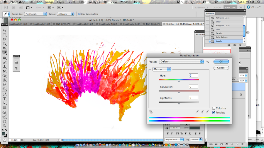
Then I tried more ugly stuff... I repeated my ink-hair-splatter-explosion thing into 3 layers, or 4 and played around with the blending modes... and saturations and hues.. to make it look like they're not the same thing.

And then I added my pretty deformed peonies! And matched them up because I love the shades cos it reminds me of fire. Except it has pink.

So then I made a um.. diagonal stripe pattern by using DEFINE PATTERN (I am so proud of myself for that) and then used that as a background, and then I used this really cool font but I had to type all the letters individually because I wanted them to be scattered and in various sizes.

I used these colors because of fire, and I like fire. Fire is intense and hot. (Hahahah it sounds like I'm talking about something else.......) and with fuel, fire would make an explosion and explosions are a perfect representation of euphoria (at least I think so...) cos I used to have this friend from New Zealand and he would describe an orgasm as a volcano erupting and he keeps bringing it up so it's like stuck in my head now. And this was like 3 years ago. Darn that guy.
But yeah this euphoric explosion produced butterfly-like deformed peonies that fly out of the circle because they're free! I think animals that fly beautifully represent freedom, so I think butterflies are kinda really suitable I guess, because they start out as a caterpillar that's like walking/crawling everywhere and stuff and then the caccoon thing happens and then they become butterflies and they're free to fly wherever they want. Freedom makes you happy! Happiness = Euphoria! Yay?
The scattered typography represents something like... uncontrollable extreme happiness. Cos the person experiencing euphoria would be all like AhdsfhkdsjhfjSIUGSFKJHjkdfhskdjhfsjkdhvjkh, but like in a good way. Sometimes I use dgdfhgkdsjhgskdjhgkds for bad things but this time I'm using it positively!
For calm, the idea was to make an outline of a person, and then mask it with a nice gradient and stars. Perhaps purple-ish stuff with sparkly stars.... But then When I was doing the outline I was just like....... omg this isn't going to work (but I didn't keep going so I'll never know). Observe the stupid process...


I was inspired by two of those pictures on the bottom left. Ultimate prettiness! So um that's the part where I gave up cos I didn't think it was gonna work. The hair looks like intestines or something... H o r r i b l e with a capital H.... Capital everything, actually. And it looks so 60s/70s, which I like... but uh... no, just.... no.
So back to square one.... Um, this is the image I traced out to make my horrible first attempt for CALM..... If you fail to see the similarities, I don't blame you hahaha. Anyway, I really like this illustration and I wanted to capture that flow-ey-ness of her hair... (Whats with me and underwater hair?) so I just drew kind of like.... flowey lines and then filled them up with a gradient. Oh by the way, don't you think that's Flotsam and Jetsam from The Little Mermaid? I guess this chick is the mermaid.... Ohhhh so pretty. It has a Jem & The Holograms feel to it, too... somehow... probably the face or the eyes. Or the eye makeup. Mermaids wear makeup?! Oh my goodness..

Anyway here is my horrible process... attempt number 2.


Then I sacked this idea because it looked beyond hideous. I like the idea though and when I pictured it in my head, it was so beautiful, hahahahahahhaah I guess I don't have enough skills. Um so then I just used the same colors from the gradient I used before, and used it as the background. I think the colors I used in the background really does justice to this piece because its resembles the sky, but it at the same time, it resembles seawater. And those are both equally beautiful and pleasing to our souls. Ahhhh.
And then I kept the flow-ey lines because flow-ey lines, to me, represent calmness... relaxation, serene, bliss, solitude, freedom. Then I looked for high resolution, stock images of brains and I found this really delicious-looking one. Hehe oops did I just expose the fact that I'm a zombie? Sarcastic & emotionlessly says, "Oh no....... please don't kill me....... I won't eat you....... I swear....." Hahahah. K k no time for lameness. So yeah. I had to scale it to a smaller size because the image was THAT big! Super convenient.

Then I used my color rage tool to get rid of the white background because I didn't want to use the pen tool because I don't believe in the pen tool, I mean.... myself.

And more masking tape. I love masking tape.


I put it in a circle, too, because the negative space aids in the feel of being in a state of calm-ness. Also, because it looked super plain and boring when it just... like that. But in a circle, it looks nicer. Circles are good. They make me think of donuts. Donuts are good.
Unfortunately I didn't take much screen shots for the opposite state of mind. Seriously, I took one. SO STUPID kfdghsdlkhdslgds. This ones my favorite one tough.

So um I used one of the scribbles I made and scanned, and then duplicated the layer and tried to make them as one. I also took the scribble I made with a marker, and um a water-color-paint-stain thing on one of the papers I used for one of my watercolor artwork... I used it because it looked like some sort of animal. I also used um, crumpled-up paper on the background, and the burn tool for the circle behind the scribble, or was this when I used a grunge texture? If it is, I sacked that idea, too because... I don't know.
The scribbly-ness = the negativity of the state of mind. The crumpled up paper represents the messed up and stressed-out-of-nervousness mind.
When my friend saw this she asked me if it was a pelican. I didn't see it, but I was like ummm sure, if you want! Because I don't know what it is and I think the idea is that people would decide what animal it is... hahhaa not me. However, I keep looking at it as an ant-eater.
You decide.


OH MY GOD I THINK IT'S A HYBRID ANIMAL! Perhaps it is a Pelicanteater. Yes, it must be.
But um I can also see a penguin in it. So the fact that the animal isn't even a proper animal represents its nervousness because it doesn't even know what animal to be! So indecisive..
I repeated the word agitated in my final work because when someone annoys you, they tend to be repeating something and you don't like that something.
Labels: illustration, visual narrative

